Below are a selection of products, whether digital or physical, that I’ve led teams to deliver. Get in touch if you’d like to learn more about any of them.
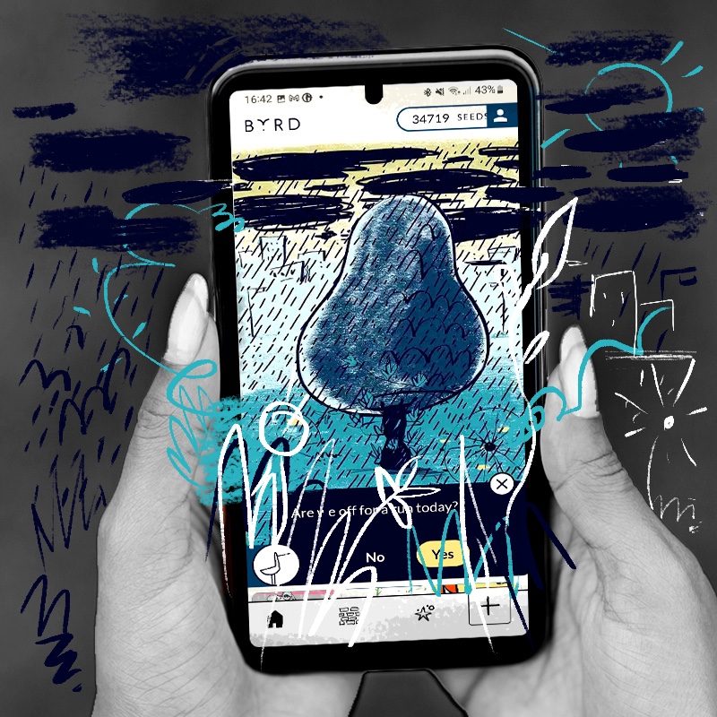

Byrd
2020 - present
Byrd's hypothesis is that we can reinforce the habit loop relating to exercise with recommendations for each day and celebrations for each activity.

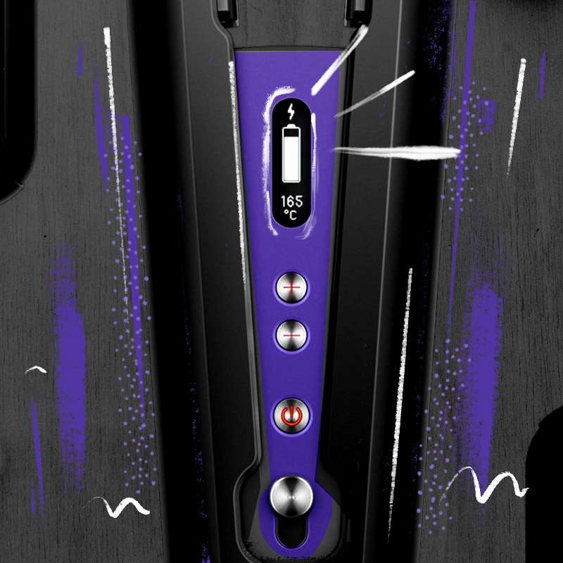

Dyson Corrale
2018 - 2019
Our hypothesis was that consumers could make better decisions about hair health and hair styling if they had more communication and feedback from their product.
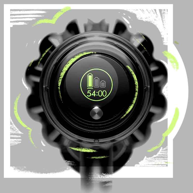

Dyson V11 UI
2017 - 2018
Our starting hypothesis was that people don’t believe battery powered vacuum cleaners can be their only vacuum. We believed giving them more information on the battery state would lead to better interactions and more sales.
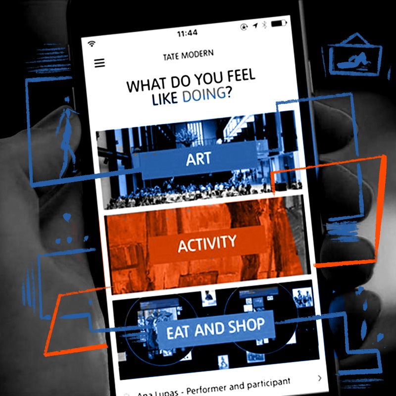

Tate visitor app
2016 - 2017
The product was born from a hypothesis that people would spend more time, and visit more frequently, if they could use their own device to navigate Tate galleries.
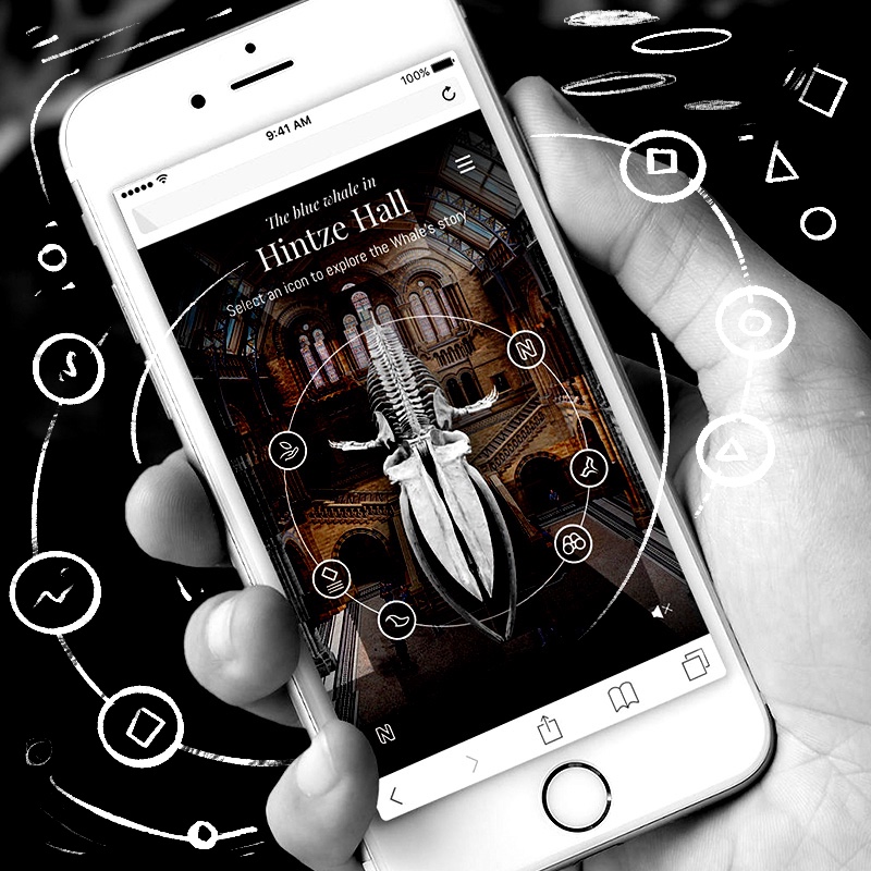
Natural History Museum
2017
The product hypothesis was that changing the central display from being the famous diplodocus to a whale risked alienating people. The team believed that a digital experience could enhance the experience of the change.

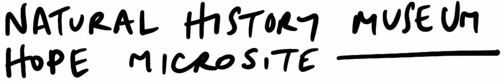
Google GDPR site
2017
The hypothesis was that Google needed to better communicate how it adhered - and went beyond - GDPR regulations to maintain trust with both consumers and governments

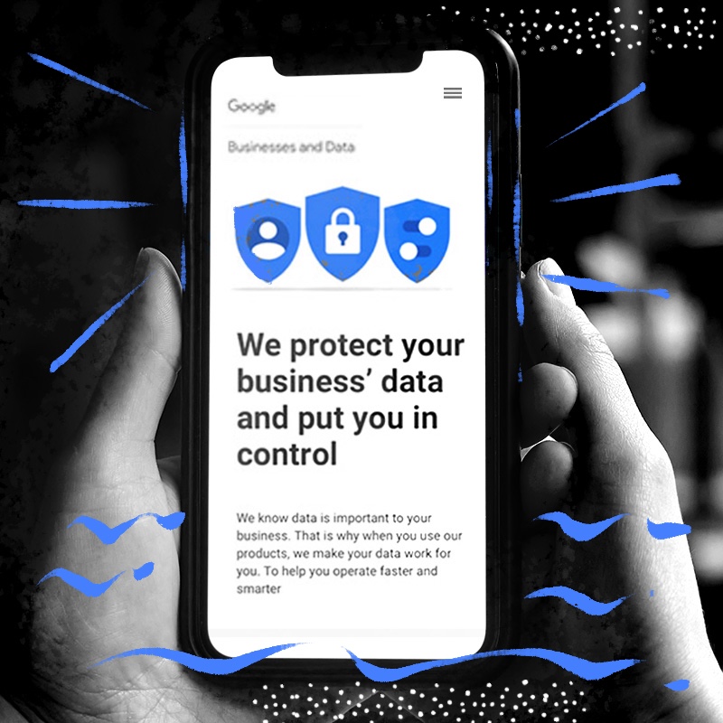
Young Lives vs Cancer Social Network
2014 - 2015
Our hypothesis was that young people with cancer found engaging with existing social networks intimidating and isolating. We believed a social network created by a leading cancer charity would create a safe space for peer support to flourish.
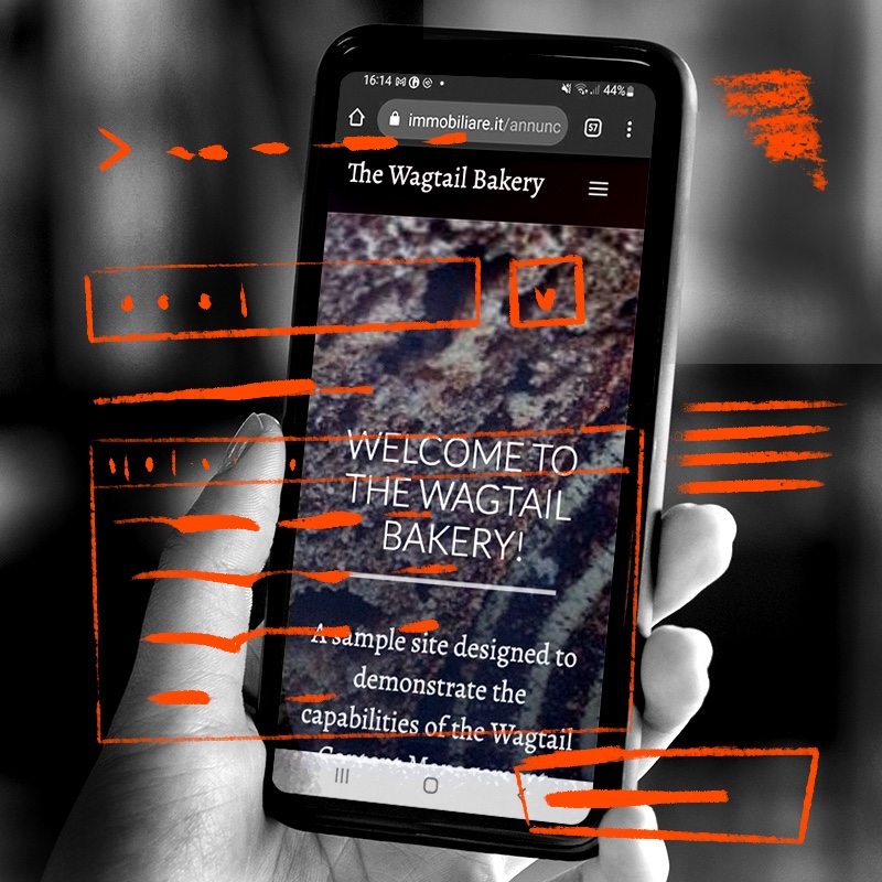

Wagtail Demo
2017
The hypothesis was that more people would adopt Wagtail if the experience of creating a demonstration version of the product was both easier to set-up and was a more useful as a starting point for a project.

Wharton Business School - Research Data Service
2016
The product was based on the hypothesis that students find it hard and expensive to get reliable market data meaning they often used incorrect or incomplete data sources for work. Designing an internal Wharton web-app using APIs to deliver data would create better experiences for students.